Diagramming tools split into two broad camps. In one, you drag shapes onto a canvas, connect them with arrows, and spend a suspicious amount of time making three boxes line up. In the other, you describe the diagram in text and let a renderer worry about the pixels.
Both camps can produce a useful picture. Both can also produce an archaeological artifact that nobody dares to edit. The real difference appears on the second edit, fifth reviewer, and hundredth diagram.
This guide compares mouse-drawn diagrams and text-to-diagram workflows without pretending that one tool fits every team, every audience, or every Friday afternoon.
Two ways to tell the same story
Imagine a small checkout flow. A customer sends an order to an API. The API reserves stock, takes payment, and publishes an event. If payment fails, it releases the stock.
In a classic diagram editor you would choose shapes, place them, label them, draw connectors, adjust routing, and apply styles. The canvas is the source of truth. What you see is what you edit.
In a text-to-diagram tool, the source looks more like this:
@startuml
actor Customer
participant "Checkout API" as Checkout
participant Inventory
participant Payment
queue "Order events" as Events

Customer -> Checkout: Submit order
Checkout -> Inventory: Reserve items
Inventory --> Checkout: Reserved
Checkout -> Payment: Charge card

alt payment approved
    Payment --> Checkout: Approved
    Checkout -> Events: OrderCreated
    Checkout --> Customer: Confirmation
else payment declined
    Payment --> Checkout: Declined
    Checkout -> Inventory: Release items
    Checkout --> Customer: Payment failed
end
@enduml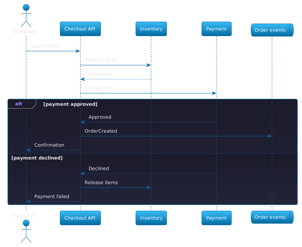
The rendered result is still a diagram. The important change is where intent lives. A canvas stores positions, sizes, routes, and formatting. Text stores participants, relationships, labels, and a few layout hints; the renderer derives the rest.
That distinction sounds small. It changes how diagrams are created, reviewed, versioned, reused, and eventually forgotten.
What “classic diagramming” is genuinely good at
Mouse-driven tools are easy to underestimate if you spend your day in an editor. Direct manipulation is powerful: point at a thing, move it, and see the result immediately. There is almost no translation between the idea in your head and the object on screen.
Freedom is the feature
A visual canvas rarely asks whether your idea fits a grammar. You can combine a product flow, two screenshots, a cloud icon, and a mildly judgmental sticky note in the same frame. That freedom is valuable during discovery, workshops, and conversations where the structure is not known yet.
It also gives you exact control. If an arrow must bend around a database cylinder and land three pixels below a label, you can make that happen. For a board presentation, a sales deck, or a carefully art-directed system map, precise composition may matter more than reproducibility.
Collaboration starts immediately
Most people understand selection handles and connectors. A product manager, designer, engineer, and customer can all contribute without learning syntax. Modern canvas tools add multiplayer cursors, comments, timers, voting, and templates. For a live workshop, these are not side features; they are the workflow.
Where it shines
- Very low barrier to entry for mixed-discipline teams
- Complete control over composition, annotation, and visual hierarchy
- Excellent for whiteboarding and ideas whose structure is still emerging
- Natural home for screenshots, sticky notes, and free-form visual material
Where it hurts
- Routine edits can trigger a chain of manual alignment and connector cleanup
- Visual diffs are hard to review precisely
- Reuse often means copying a board and creating another source of truth
- Large diagrams become slow to navigate and easy to format inconsistently
The awkward truth is that the same freedom that makes a canvas fast on day one can make it expensive on day one hundred. Nothing forces two similar diagrams to use the same names, styles, or boundaries. Every copy can drift independently.
Where the canvas starts charging interest
The first version is rarely the expensive one. Maintenance is.
Suppose Checkout API becomes Order Service, and the service now authorizes payment before reserving inventory. On a canvas, you update the label, reroute arrows, move boxes, repair the spacing, and inspect every nearby element for accidental movement. The semantic change is simple; the mechanical work is not.
This is layout debt: time spent preserving the picture rather than improving the model.
Reviewers see pixels, not intent
Binary or proprietary canvas files work poorly with the review habits engineering teams already have. A commit may say that the diagram changed, but not whether a relationship was added, a typo was fixed, or twenty objects shifted by one pixel. Even tools with version history tend to show snapshots rather than a clean semantic diff.
You can export SVG and compare it, but an SVG diff mostly describes coordinates and generated identifiers. It does not say, in human terms, “Payment now returns an authorization token.”
Repetition multiplies drift
Architecture documentation often contains the same service in a context diagram, a deployment diagram, two sequence diagrams, and an onboarding guide. With manually drawn assets, shared concepts are usually duplicated. Rename a service and someone has to find every picture.
They will not find every picture.
That is how documentation becomes folklore: each diagram is locally plausible, but nobody knows which one matches production.
What text-to-diagram changes
Text-to-diagram treats the source as a small program. The source declares elements and relationships; a renderer turns those declarations into an image. PlantUML, Mermaid, D2, Graphviz, and Structurizr DSL make different trade-offs, but they share that basic model.
Here is the same kind of flow written with Mermaid:
flowchart LR
    PR[Pull request] --> CI{Checks pass?}
    CI -- No --> Fix[Fix and push]
    Fix --> CI
    CI -- Yes --> Build[Build image]
    Build --> Deploy[Deploy production]
    Deploy --> Verify[Verify health]

    classDef decision fill:#312e81,stroke:#818cf8,color:#fff
    class CI decision
Changing the process means changing a few lines. Git can show the exact difference. A reviewer can comment on the new relationship. The diagram can be rendered in CI, included in a documentation site, and regenerated every time the source changes.
Version control becomes useful
Plain text fits Git. You get branches, blame, diffs, review comments, merge conflict resolution, and a history that answers why a connection exists. The diagram can live next to the code or decision record it explains.
A review diff such as this is immediately legible:
- Checkout -> Inventory: Reserve items
Checkout -> Payment: Authorize card
+ Checkout -> Inventory: Reserve itemsNo screenshot comparison. No hunting for the moved arrow. The change in ordering is the review.
Consistency becomes the default
The renderer applies the same spacing, typography, arrow styles, and theme each time. Authors stop debating whether a box should move six pixels to the left. Shared includes, themes, and conventions make diagrams across a repository feel related.
Consistency is not merely cosmetic. A stable visual language reduces the mental work required to read each new diagram.
Automation stops being exotic
Because the input and output are files, a build can:
- validate the source;
- fail on invalid syntax;
- render SVG or PNG assets;
- publish them with the documentation;
- link every output to the source that generated it.
You can also generate a diagram from known data. A service catalog can produce a dependency graph. A test suite can publish a sequence for a protocol. A repository can rebuild documentation without someone opening a desktop application and clicking Export.
AI-native documentation workflows
Text-to-diagram is also a natural interface for AI agents. An agent can read the same compact source that a person reviews, update it alongside a code or specification change, and explain exactly which participants and relationships must change. That makes architecture documentation easier to keep current and gives teams a precise way to show an agent what should be built.
A canvas forces the agent to reason about coordinates, selection state, and connector routing. Text lets it work with the meaning of the diagram. The result is still reviewable source rather than an opaque image generated from a prompt.
Refactoring changes meaning, not pixels
Semantic refactoring is much cheaper when an automatic layouter owns placement. Replacing one box in a data-flow diagram with two new boxes and the arrows between them is a small source edit. The renderer chooses positions that reduce crossings and keeps the surrounding graph coherent. On a canvas, the same change can turn into hours of moving nodes, rerouting connectors, and repairing spacing by hand.
Creation runs at typing speed
Once you know the syntax, text-to-diagram is dramatically faster for prototyping and for producing the final diagram. You are limited mostly by how quickly you can think and type, not by how quickly you can search a shape library, drag elements into place, and align them with a mouse.
Where it shines
- Precise Git diffs, normal code review, and useful history
- Repeatable rendering and consistent visual conventions
- AI-native source that agents can maintain with code and specifications
- Fast semantic refactoring with automatic layout and connector routing
- Rapid creation once syntax is familiar: think, type, and render
- Works naturally with CI, static sites, and documentation repositories
Where it hurts
- Syntax and tool-specific concepts create an initial learning curve
- Automatic layout can be stubborn when exact composition matters
- Free-form workshops and mixed media feel less natural
- Large sources still need deliberate boundaries and architecture
Diagrams as code are not magic
“It is code” does not automatically make a diagram accurate, readable, or worth maintaining. A 900-line sequence diagram is still a 900-line sequence diagram. It just has excellent version history.
You trade layout work for modeling work
Automatic layout removes pixel pushing, but it cannot decide what belongs in the diagram. Authors still need to choose the audience, scope, abstraction level, and narrative. In fact, a strict language can expose fuzzy thinking earlier because every vague cloud must become an element with a name and relationship.
That is usually healthy. It is not always comfortable.
Renderers have opinions
Graph layout is a hard problem. Add one connection and the renderer may rearrange half the picture. You can influence direction, grouping, hidden links, and spacing, but exact placement is deliberately limited.
If your success criterion is “this database icon must sit exactly under the center of this label,” a canvas is the honest choice. Fighting an automatic layout engine until it imitates a manually composed poster wastes the main benefit of text-to-diagram.
Syntax is part of the interface
PlantUML is approachable, but it is still a language. Mermaid is common in Markdown platforms, but different renderers may support different versions. Structurizr DSL is excellent for C4 models, but it asks authors to understand the model behind the views.
Tool choice matters less than team fit. A format only scales if the people responsible for the documentation can read and change it.
A fair head-to-head comparison
| Question | Mouse-drawn canvas | Text-to-diagram |
|---|---|---|
| First sketch (new to syntax) | Usually faster | Slower while learning the language |
| Creation (syntax familiar) | Limited by manual placement | Fast: think, type, and render |
| Exact placement | Full control | Intentionally constrained |
| Git diff | Weak or noisy | Precise and semantic |
| Mixed-media workshop | Excellent | Awkward |
| Consistent styling | Requires discipline | Mostly automatic |
| Reuse | Templates and copying | Includes, variables, generation |
| CI rendering | Tool-dependent | Natural fit |
| Non-technical editing | Accessible | Requires onboarding |
| Large-scale maintenance | Manual overhead grows | Source stays manageable if scoped |
| One-off executive visual | Strong | Often too rigid |
The table points to a boundary: classic tools optimize the act of drawing, while text-to-diagram optimizes the lifecycle of a diagram.
Choose based on the diagram’s job
The format should follow the job, not personal identity. You do not have to become a “diagram-as-code person.” You need to decide what kind of artifact you are making.
Choose a visual canvas when…
- the group is discovering the problem live;
- participants need to contribute without learning syntax;
- screenshots, sketches, sticky notes, and spatial clusters carry meaning;
- the final composition needs pixel-level art direction;
- the artifact is short-lived or intentionally disposable.
A user journey workshop is a good example. The conversation is the product; the board is evidence that the conversation happened. Optimizing that board for Git would miss the point.
Choose text-to-diagram when…
- the diagram explains software or infrastructure that changes regularly;
- engineers should review it with the related code;
- several views reuse the same names or components;
- the output is published by CI;
- stale documentation creates operational or onboarding risk;
- you expect the artifact to live longer than the meeting that created it.
An authentication sequence next to the service implementation is an obvious candidate. A one-line change in the protocol should produce a one-line change in the diagram source.
Use both when the work has two phases
A hybrid workflow is often the most sensible:
- Explore on a canvas. Work quickly, invite everyone, and let the model be messy.
- Decide what deserves to survive. Not every sketch should become documentation.
- Encode the durable model. Rebuild the important view as text near the relevant code or docs.
- Review the meaning. Use a pull request to confirm names, boundaries, and relationships.
- Render on publish. Let the build keep the image synchronized with its source.
The redraw is not necessarily waste. It is a useful compression step: transient workshop material becomes a deliberate model.
How to start without creating a diagram platform
Teams sometimes turn a simple format change into a six-week internal tooling initiative. Resist the urge. A maintainable start is small.
1. Pick one recurring diagram type
Sequence diagrams are a strong entry point because their source reads naturally and ordering is explicit. Architecture context diagrams also work well if the team already agrees on system boundaries.
Do not migrate every existing board. Choose one living diagram that is painful to maintain and prove that the new workflow improves it.
2. Store source next to the truth
If a diagram explains a service, keep it in that service repository or its canonical documentation repository. A central diagram dump may look organized while separating every picture from the change that invalidates it.
Use predictable names:
docs/
architecture/
checkout-sequence.puml
checkout-sequence.svgWhether you commit rendered assets depends on the publishing system. Committing SVG makes local browsing easy; generating it only in CI avoids duplicated artifacts. Either policy works if it is explicit and enforced.
3. Establish three conventions, not thirty
Start with:
- one theme;
- one naming style;
- one rule for where sources live.
Add rules only after repeated real problems. A style guide nobody remembers is just a second stale document.
4. Make validation boring
The build should fail clearly when a diagram cannot render. Pin the renderer version. Avoid relying on a developer’s global installation. Make the same command work locally and in CI.
The best pipeline is not clever. It is predictable enough that nobody thinks about it.
The deeper difference: artifact versus model
A mouse-drawn diagram is primarily a visual artifact. Its coordinates are meaningful because the author put them there. Text-to-diagram is closer to a model that can produce a visual artifact. Its relationships are meaningful, and coordinates are an implementation detail.
Neither representation is universally superior.
Artifacts are expressive. Models are transformable. Artifacts are ideal when visual nuance carries the message. Models are ideal when structure must remain correct across changes, formats, and teams.
The mistake is asking one representation to behave like the other. A free-form strategy map does not improve because it lives in Git. A critical service interaction does not become maintainable because its boxes are beautifully aligned.
So, which one scales?
Text-to-diagram scales better as maintained engineering documentation. It works with the tools engineers already use, makes changes inspectable, reduces formatting work, and opens a straightforward path to automation.
Classic diagramming scales better across participants and visual possibilities. It welcomes more people, supports ambiguity, and gives authors precise control over a one-off result.
The useful question is not “Which kind of diagram is modern?” It is:
Will this picture be edited like a design artifact, or maintained like part of the system?
If it is an artifact, draw it. If it is part of the system, describe it. And if it begins as one and becomes the other, change formats without guilt.
The goal was never to win an argument about boxes and arrows. The goal is to help the next person understand the system—and to make sure the diagram still tells the truth when they arrive.